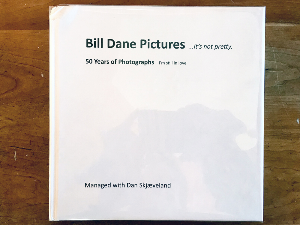
JTF (just the facts): Self published in 2020 (here). Hardcover, 10×10 inches, 326 pages, with 222 reproductions in color and monochrome. Includes 100 texts by the author and an afterword by Dan Skjaeveland. In an edition of 500 copes. (Cover and spread shots below.)


Comments/Context: For those who’ve followed Bill Dane’s journey from the start, the opening image of his 50 year retrospective …it’s not pretty: 50 Years of Photographs, I’m still in love will come as no surprise. It begins where his photo career began, with a postcard. The front shows a full-bleed photo of the Standard Oil Company in Point Richmond near Dane’s home in California. On the back is a brief message in Dane’s thick cursive describing the scene, stamped END THE WAR, and postmarked May 12th, 1972.
By Dane’s estimate, this is one of 69000+ postcards he sent out over the course of four decades. 69,000 postcards! That’s a massive output by any measure. Nowadays, digital methods have eased photography’s production chain, but when Dane began his mail art project in 1969, the available tools were more limited. He made silver gelatin postcards, printed, written, postmarked, and delivered by hand. These cards were nothing elaborate, usually just a picture and short missive. But they were highly effective at putting Dane’s name and images into wide circulation. Long before MailChimp, he practiced a prototypical form of social media blast, photobombing the world with thousands of pictures.
Bill Dane’s targeting wasn’t completely scattershot. Certain addresses were key, and among his regular recipients—in fact the addressee of the Standard Oil card mentioned above—was John Szarkowski at MoMA. Pestering the most powerful gatekeeper in photography with daily postcards may have been a cheeky initiative, undertaken “to funky crash the MoMA” in Dane’s words. Nevertheless it paid off. Dane’s freewheeling style—somewhere between Lee Friedlander and Sun Ra—found favor with Szarkowski. He became a fast admirer and Dane quickly found himself swept into the early 1970s photography canon, a position solidified when Szarkowski curated the solo show Unfamiliar Places: A Message from Bill Dane at MoMA in 1973. This was a slideshow selected from the 1500 postcards which Dane had sent Szarkowski over a four year period. More postcards were featured in the landmark 1974 Aperture volume The Snapshot, followed by juried appearances in the major Szarkowski exhibitions Mirrors And Windows (1978) and American Landscapes (1981). At this point Dane seemed well on the way to stardom, as recounted in the book’s afterward by Dan Skjæveland:
“The attention surrounding [Dane’s] work grew steadily and by 1982 he had received two Guggenheim Fellowships, two NEA fellowships, and was represented by Fraenkel Gallery, one of the elite photography galleries on the West Coast….In 1992 he had a show of 30 x 40 color prints at Fraenkel Gallery titled Bill Dane: History of the Universe, and in 1993 the Provincial Museum of Granada in Spain showed 60 Black and white prints in a retrospective show titled Bill Dane: Outside and Inside America. Catalogs were produced for both. It seemed Bill was heading in the direction of some contemporaries.”
As it turned out, Dane’s path took an alternate course. After switching to color in the mid 1980s, Dane’s style gradually became more adventurous and less accessible. Most importantly from a career perspective, it was less marketable. Dane’s personality had always been a square peg in the round hole of highbrow art. Such a countercultural stance can be an asset under the right conditions, but in the face of waning sales it was a liability. Dropped by Fraenkel, Dane had a hard time sticking with any gallery in the years to follow. The 1993 catalog Bill Dane: Outside and Inside America would eventually prove to be a high water mark of sorts. It was his last publication of any kind until the current one. By the early 2010s, when Bill Dane began to post his work to Flickr—which he imagined as a digital extension of his postcard project—his name had receded into relative obscurity.
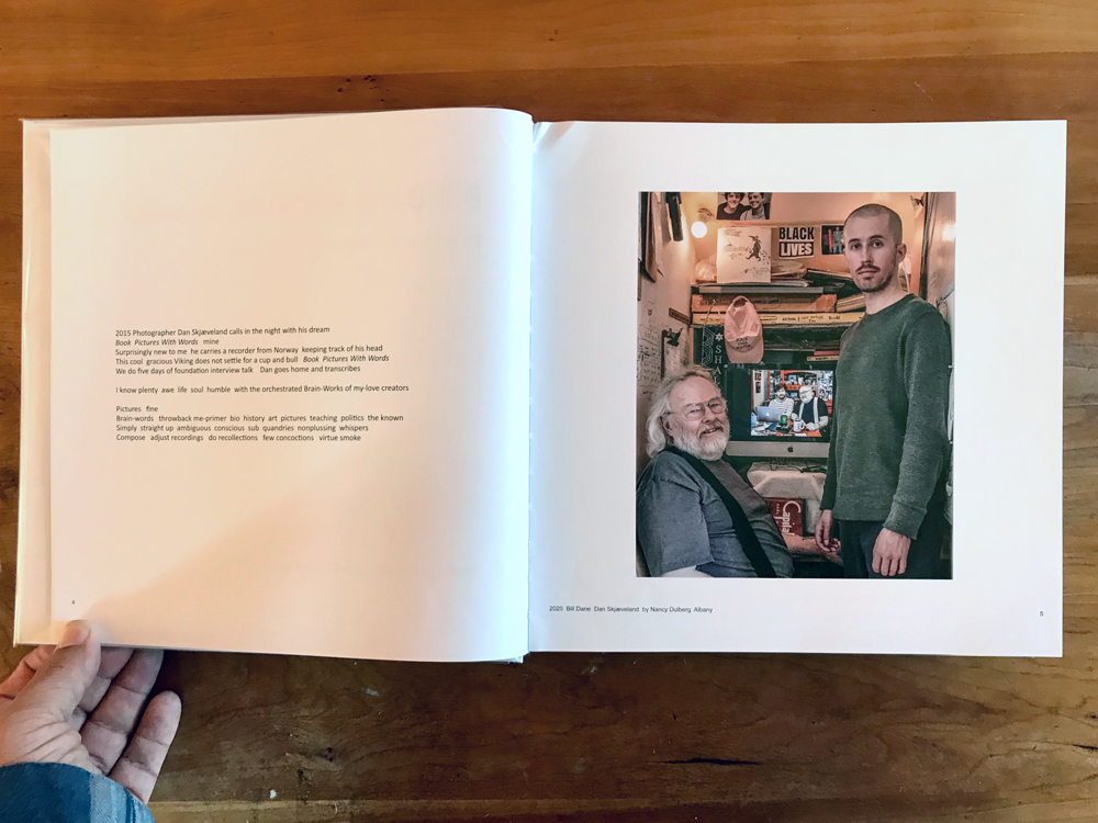
This is where Dan Skjæveland entered the picture. In 2012 the Norwegian photographer—“this gracious cool viking”—stumbled on Dane’s work online and quickly became entranced. Who was this overlooked master, and why was he not better known? In 2015 he flew to Dane’s home, conducted five days of interviews, and spearheaded the effort which would eventually become the current monograph. Whereas most photobooks are described as authored or edited, …it’s not pretty carries a byline which is different and probably more accurate: Managed with Dan Skjæveland. In this case “managed” includes everything from scanning to transcription to design to production to distribution and more. Skjæveland has embraced Dane’s archive with missionary zeal, and also with the hope of converting unbelievers. “I can’t help being surprised by the disappearing institutional interest in his pictures,” he muses. “Perhaps [the world] is ready now.”
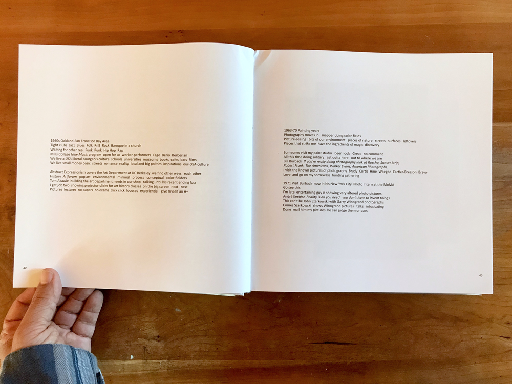
Reintroducing a star from yesteryear is a complicated task. Where does one start? …it’s not pretty tackles everything in one fell swoop. This huge volume includes a quick primer on Dane’s early monochrome years, a selective chronology of highlights since, free-form diaristic chunks of Dane’s life story, and bits and pieces from the art world, showcasing critical reactions and commentary. Such a multitask is probably beyond the scope of any single title, but this one succeeds on a certain level. Its multifaceted form conveys a strong sense of Bill Dane as artist and wonderfully eccentric personality. Dense with information, chaotic, peculiar, and beautiful, the book hews closely to its subject.
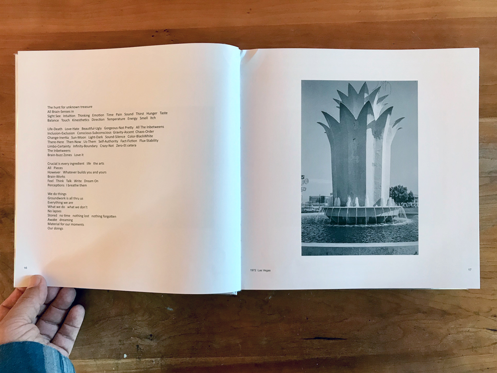
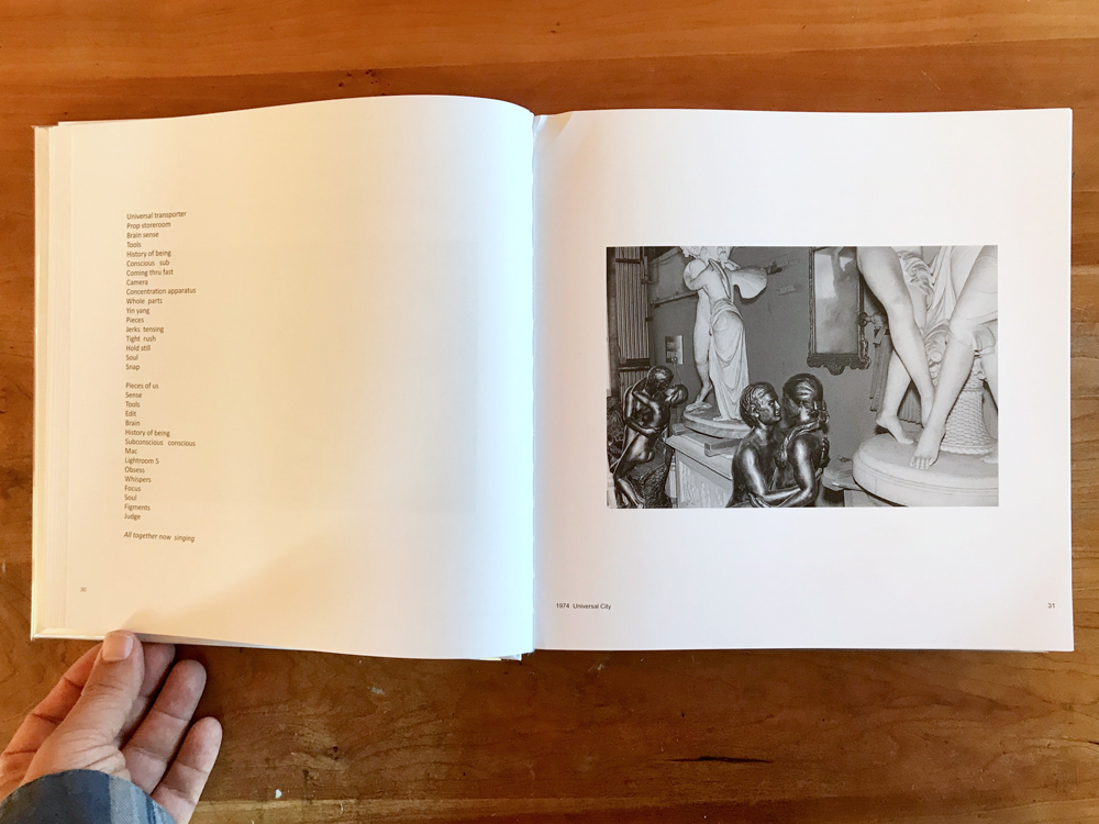
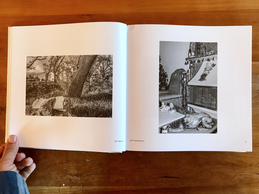
Dane’s photographs are shown in chronological order, an important organizational feature since it keeps them from careening out of control. Captioned by date they allow the reader to carefully study the evolution of Dane’s visual style. For roughly his first 15 years as a photographer, he shot in black and white. During the core of this period he was in a rare zone, seeing exceptionally well and compiling an oeuvre for the ages, most of which wound up in the US mail, and then MoMA.
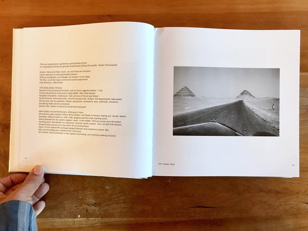
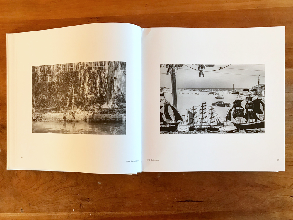
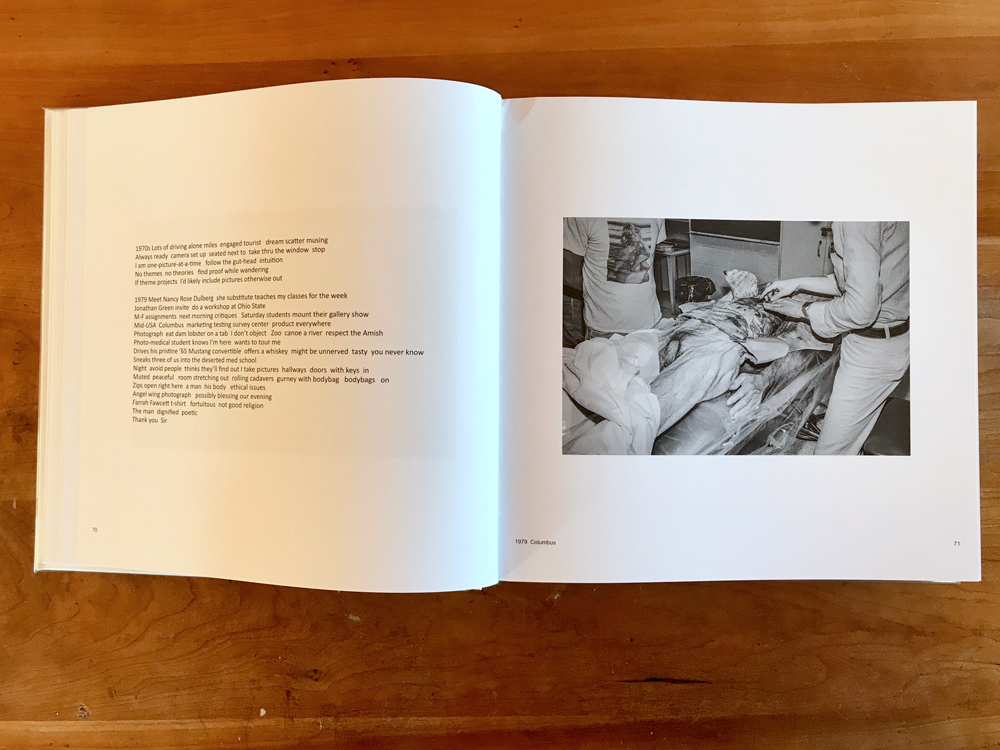
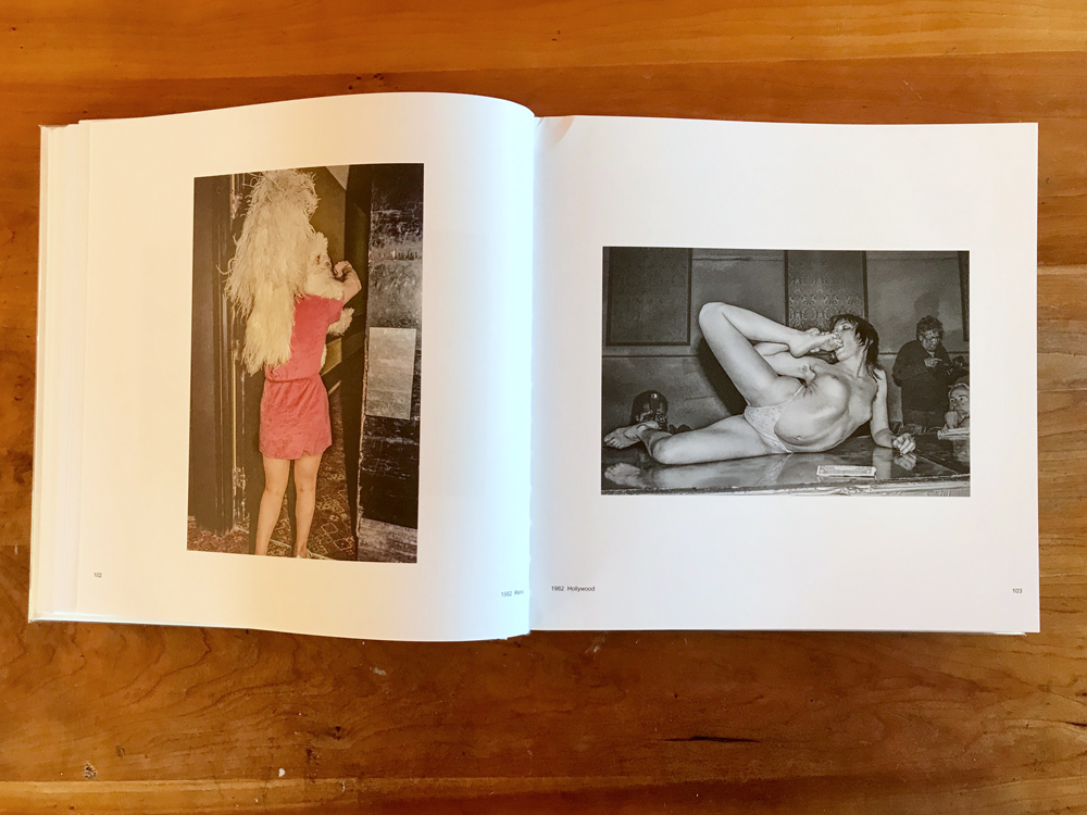
Dane traveled widely, had a voracious appetite for material, and felt few constraints for subject matter. Using flash and natural light, near and far perspectives, crowds and depopulated scenes, all interchangeably, he employed a wide-open approach which treated the world as visual playground. The book bounces around accordingly. A 1972 photograph from New Orleans combines a parade float with onlookers into a strange circular soup. An obscured landscape showing some apartment buildings and clouds reminds one of Wright Morris, while the very next photo is a garishly lit interior showing cropped statues and bric-a-brac. Dane’s car hood appears in the frame as he travels through Egypt. He shoots Winogrand at the Ivar in Hollywood, schooners silhouetted in Galveston, the soapy water of a washing machine, and a desiccating corpse in Columbus. Everything is fair game, and the reader is kept guessing what, when, or who will turn up next.
One gets the sense of a restless, tireless explorer, continually exploring new motifs, and refusing any obvious tropes. The photographs are so delightfully varied that it’s hard to connect them stylistically or assign them to a single author. Their flippancy gave some fits, as exemplified by AD Coleman’s snarling review in 1973: “a collection of random snapshots by someone who has not even established enough craft competence to make his disregard of craft standards a significant esthetic choice.” Even Szarkowski was left tongue-tied trying to give them coherence: “the discovery of classical measure in the heart of God’s own junkyard, the discovery of a kind of optimism, still available at least in the eye.”
This last quote is from Bill Dane: Outside and Inside America, in which many of these early photographs were originally published. Although they are just as enjoyable in their current iteration, the new printing style is quite different. The exact reasons for that are unclear, but may have roots in Dane’s decision in 2007 to digitize his archive and discard the original negatives. In any case the newer reproductions have a revamped tonality, with condensed highlights, increased sharpening and contrast, and shadows opened up several stops. In a word, they look computerized. It’s probably unfair to compare them to Outside and Inside America, whose lush reproductions were as bold and gorgeous as any photo monograph in memory. Some may favor the new revisions, but in my opinion the versions as originally printed were superior.
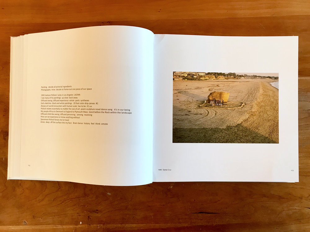
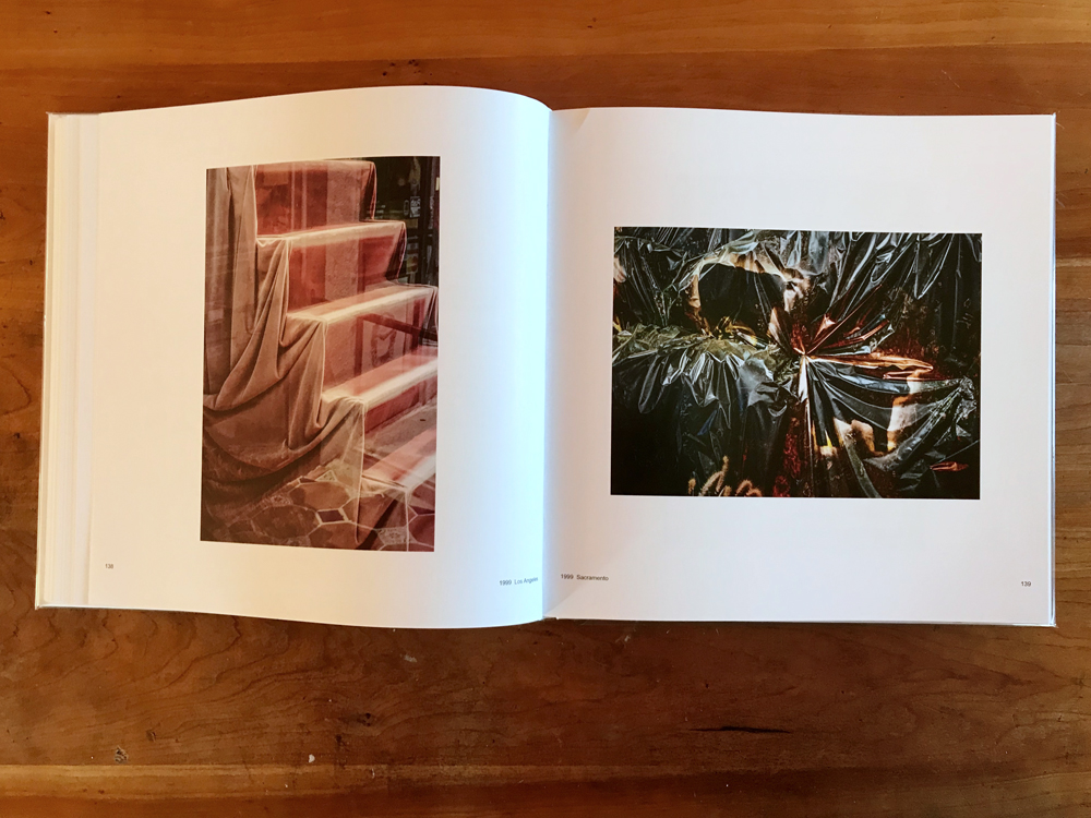
Roughly 100 pages in, the monochrome images begin to give way to color. Within a few dozen pages (somewhere around the late 1980s) color pictures become exclusively dominant. At first the scenes are similar in spirit to Dane’s monochrome pictures. It’s as if he’s just replaced b/w film with color and applied the same visual language. Pictures of a giant beached boulder and curtain-draped staircase are offbeat, yet still keep one foot in the real world.
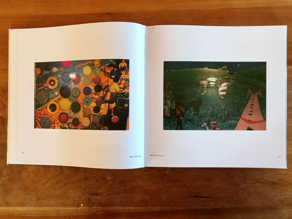
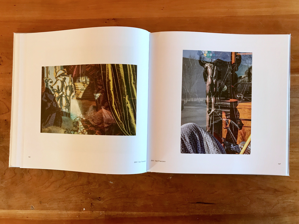
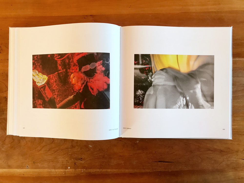
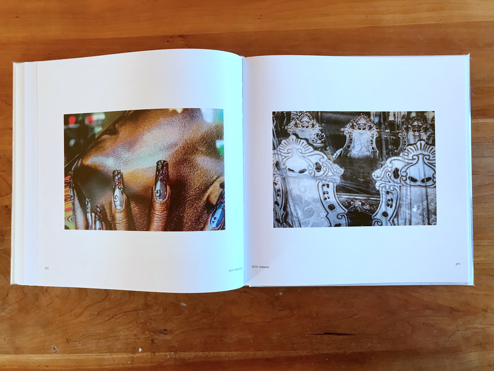
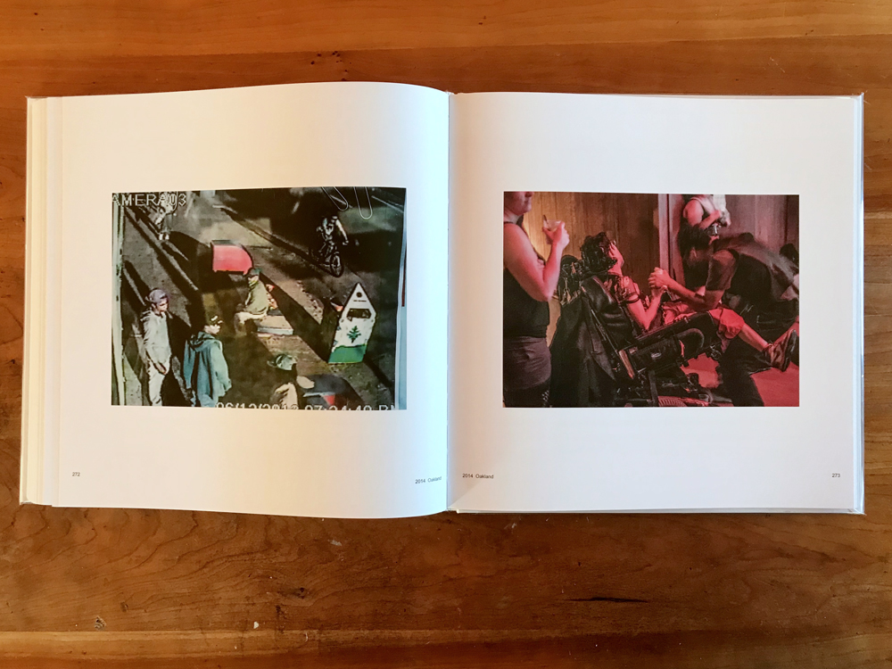
As the book moves through the 1990s and into the new millennium, Dane’s photos become stranger and stranger. Whereas people were a common element in Dane’s earlier work, they give way here to inhuman artifacts, eventually disappearing entirely from his frames as they drift unanchored into abstraction. It’s harder to tell where on earth they are from, what caught the photographer’s attention, or what they might symbolize. The 1992 booklet Bill Dane: History of the Universe captured Dane as he began to toy with these ideas. …it’s not pretty pushes far past where that book left off, past recognizability in many cases.
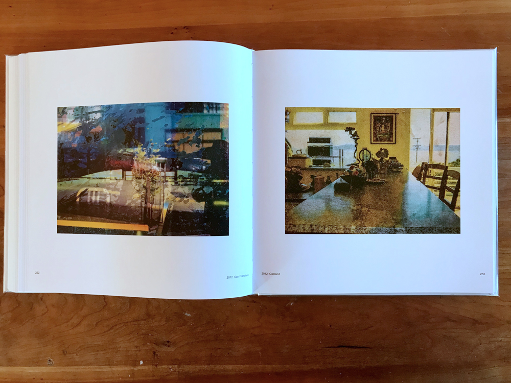
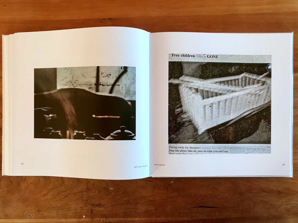
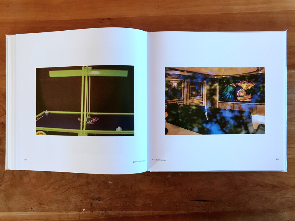
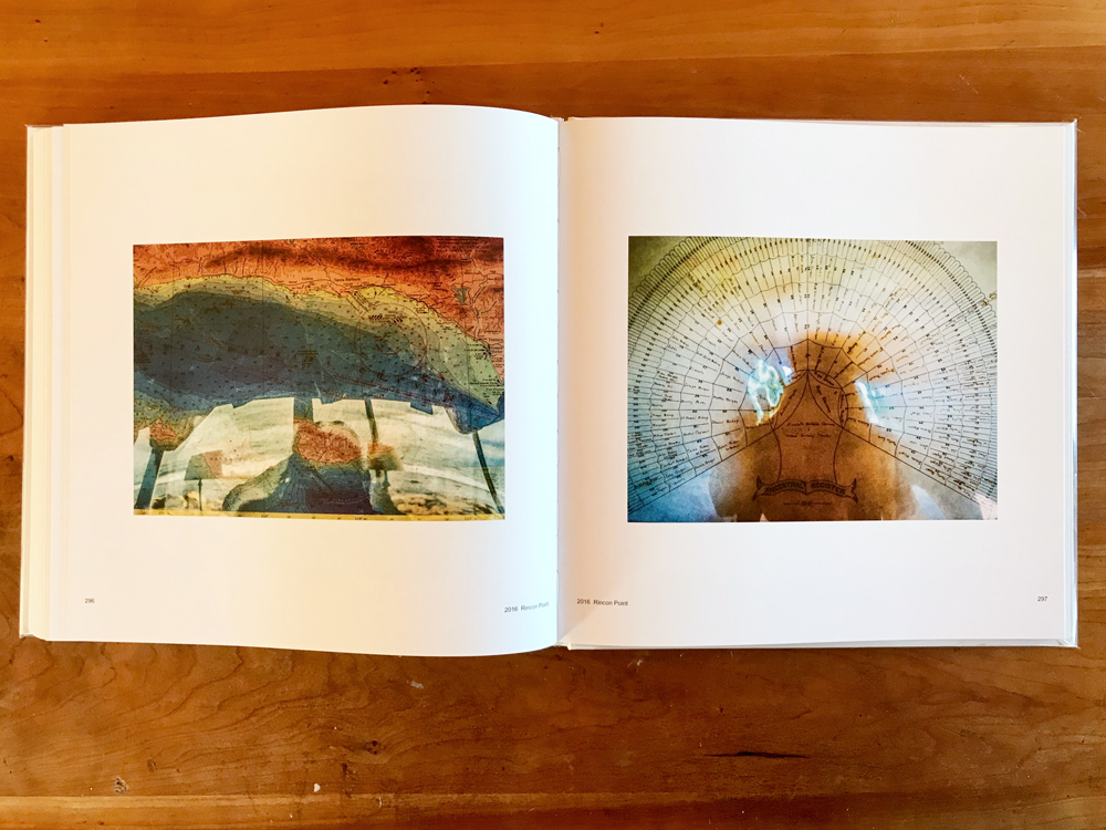
Like his contemporary Luigi Ghirri, Dane appropriated existing images interchangeably with found forms, often mixing them in the frame into a colorful pastiche. Words and pixelation were no bother, and he was fascinated with window reflections and their ability to encompass multiple worlds in one frame, adding another level of confusion. Photographs like Martinez 2001, San Francisco 2004, and Albany 2007 trail off into abstract expressionism, verging on pure form, with scant tie to the original scene. Later photos melt away into psychedelic color fields.
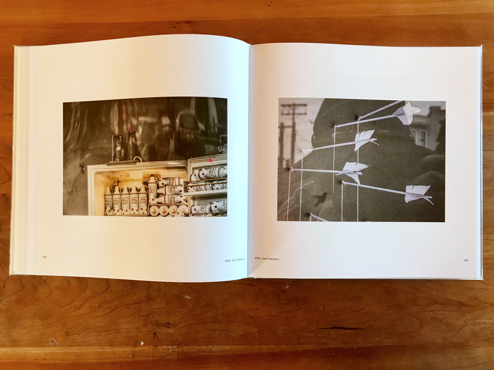
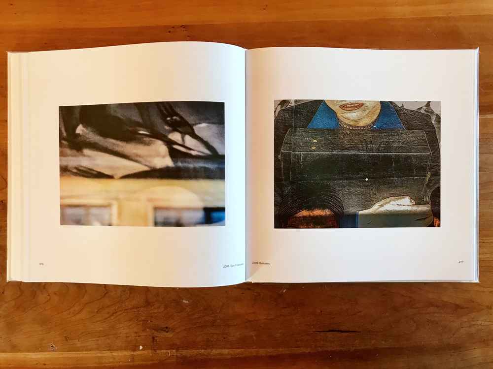
Dane originally trained as a painter, so perhaps it was inevitable that photography’s narrative element would eventually lose its hold on him. Picking through the final third of the book the reader leaves traditional photography behind entirely, entering a strange new territory of raw color blocks, appropriated signs, cropped artifacts, and pure visual expression. Dane is not the first to explore abstraction in photography. Keld Helmer-Peterson, Frederick Sommer, Aaron Siskind, and Ernst Haas have been down this road before. But few have pushed it to such extremes.
If one gets the sense of a free spirit following his own muse, this is enhanced by the written passages which appear frequently throughout the book. There are 100 of these text blocks in total, some of them spilling into multiple pages, providing a respite from the steady drumbeat of his photos. These writings are presumably adapted from Skjæveland’s audio interviews, and they have the choppy informal quality of conversation. Dane takes broad poetic license with formatting, grammar, and syntax—beginning with the title itself—imbuing his thoughts with the fleeting dreaminess one might find on the back of a postcard.
Unlike the accompanying pictures these snippets are not sequenced chronologically. Instead they come sporadically, pulled at random from the past. The emphasis is on art and photography, but Dane dips into many subjects along the way: music, critiques of capitalism, teaching high school, family, travel anecdotes, world events, all in a rambling jumble. “Fuck this elitist shit.” “Our crafts not easy… I love big sense craft it’s everything.” “Zones deep off the surface into my face Brain-sense history feel think emote”
Reading between the lines we gradually learn the history of Dane and his path from Pasadena, 1938 to the present. But the gaps are filled in piecemeal. It’s the same the way old memories surface, in fits and starts, leaning more on sentiment than logic. “What makes a good photograph? Our good brain-sensing, Good visual lyric poetry serendipity.” “Capitalism is the cause of sick…They alienate disconnect crush…” And so on.
These are the scattered thoughts and memories of an octogenarian artist, one more willfully enigmatic than most. To collect them into a cohesive retrospective is a tall order, and taller still is the task of generating buzz. Nevertheless, Skjæveland imagines …it’s not pretty as a vehicle for Dane’s rediscovery. The book drops hints of career resurrection, or the hope of it. On the rear cover is a 2013 letter from Ben Lifson to Dane, acclaiming his recent work and inquiring into exhibition prospects. Alas, Lifson passed away shortly after sending it, and before his influence could have any bearing. The last few pages of the book contain testimonials from various cultural figures. Responding to the book itself, accolades like these are typically used as cover blurbs to boost sales. Tucked into the book itself, they are oddly self-referential. Anecdotes referring to gallery disappointments—“I love your pictures, I wouldn’t have the slightest idea how to sell them”—signal an artist who has felt spurned, and is eager for a rebound.
Perhaps Skjæveland is right, and this book can kickstart interest in Dane. But it seems unlikely. In a contemporary photo world of established routines and convention, …it’s not pretty comes out of left field. Its exuberance is infectious, but many readers will be overwhelmed, and some put off entirely. Dane’s photography can be obtuse, with no easy point of entry, a trait which is especially true of his latter career. His words may also be tough sledding for the casual browser. But those who put in the effort will be rewarded.
All of which is say to fresh converts may be few. But if …it’s not pretty washes up in a publishing eddy alongside the main current, that’s perhaps fitting. Dane has followed his own path from the start. To some extent, he has staked his artistic identity on idiosyncrasy. “You know plenty if you’re Outside, if you feel a taste of Outsider,” he writes, with the hard-earned wisdom of someone who’s been both inside and outside: of America, the spotlight, and general favor.
Collector’s POV: Bill Dane does not appear to have consistent gallery representation at this time. Collectors interested in following up should likely connect directly with the artist via his website (linked in the sidebar).


Fascinating photos and life of an unbound artist. Thanks, Bill.
You’ve written a perfect article of photography criticism from a collector’s perspective, Blake Andrews! I read the following portion with pleasure, as I’ve observed similarly with other photographer’s works:
You pulled it all together and explained the cause being, in Bill Dane’s case, his decision to digitize his archival works in 2007.
I could not have discarded original negatives.
You’re correct in inferring Bill Dane’s recent (well, since maybe 2010) interest in greater visibility for his work. He has left a trail of Internet breadcrumbs hinting at such, remarkable because he seems to have done so entirely on his own, no publicist, professional representation, all self-taught in new media. His hints are modest and oblique.
Your description, of a willfully enigmatic artist, even more so than most, is astute. I don’t know if active URLs or even html tags for style are allowed in comments, so I will not link to Bill Dane’s own 45 second video promotion of “It’s not pretty…”.
I discovered you–and Bill Dane–on flickr. Long may the three of you prosper.