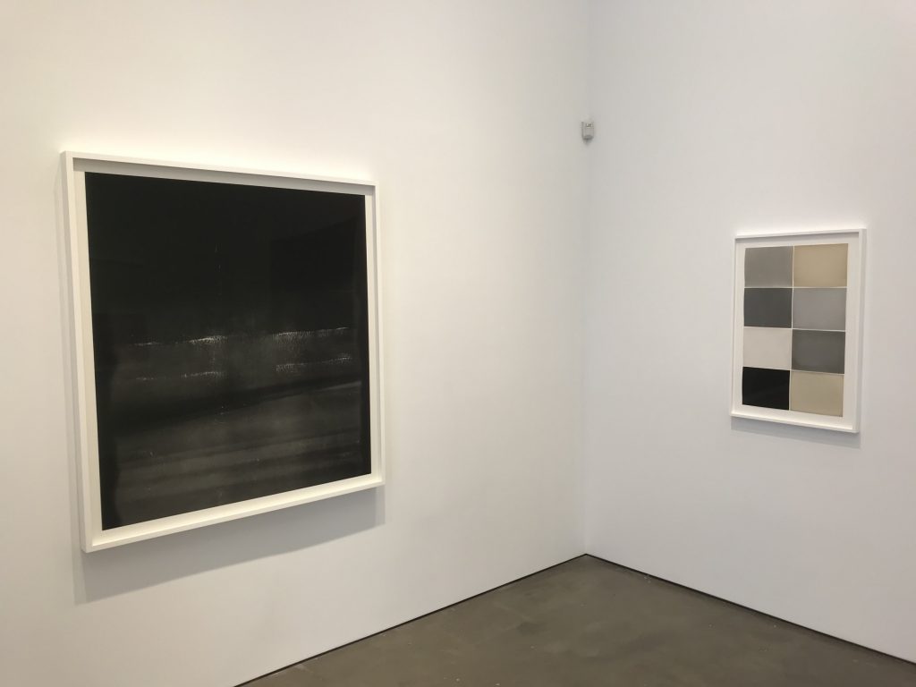
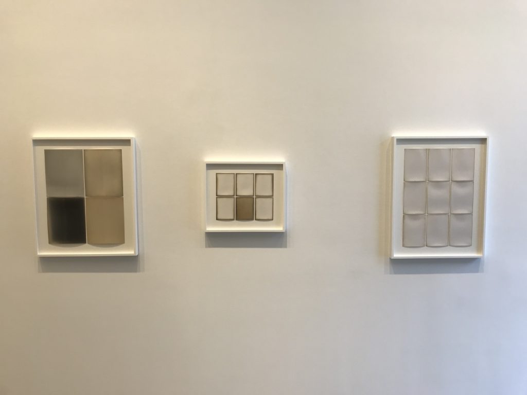
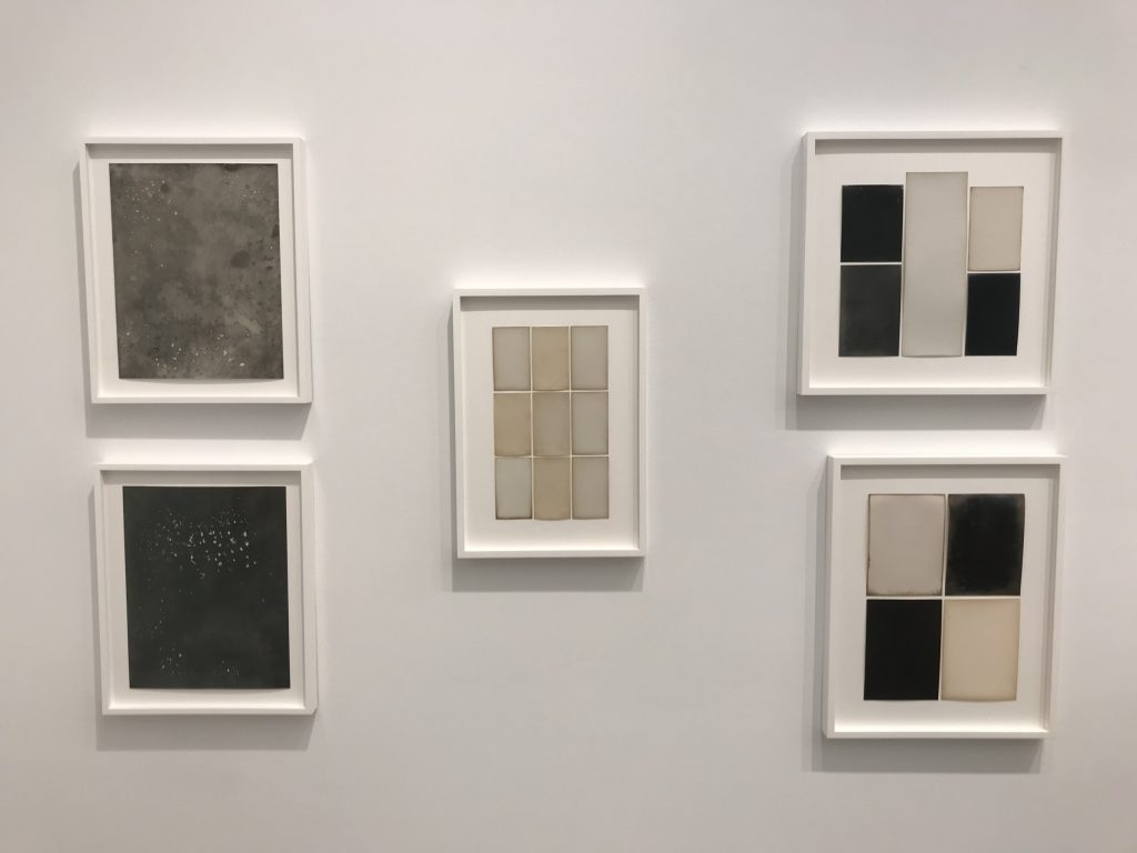
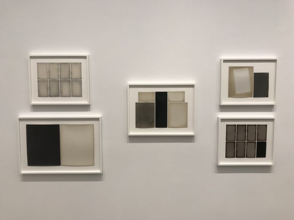
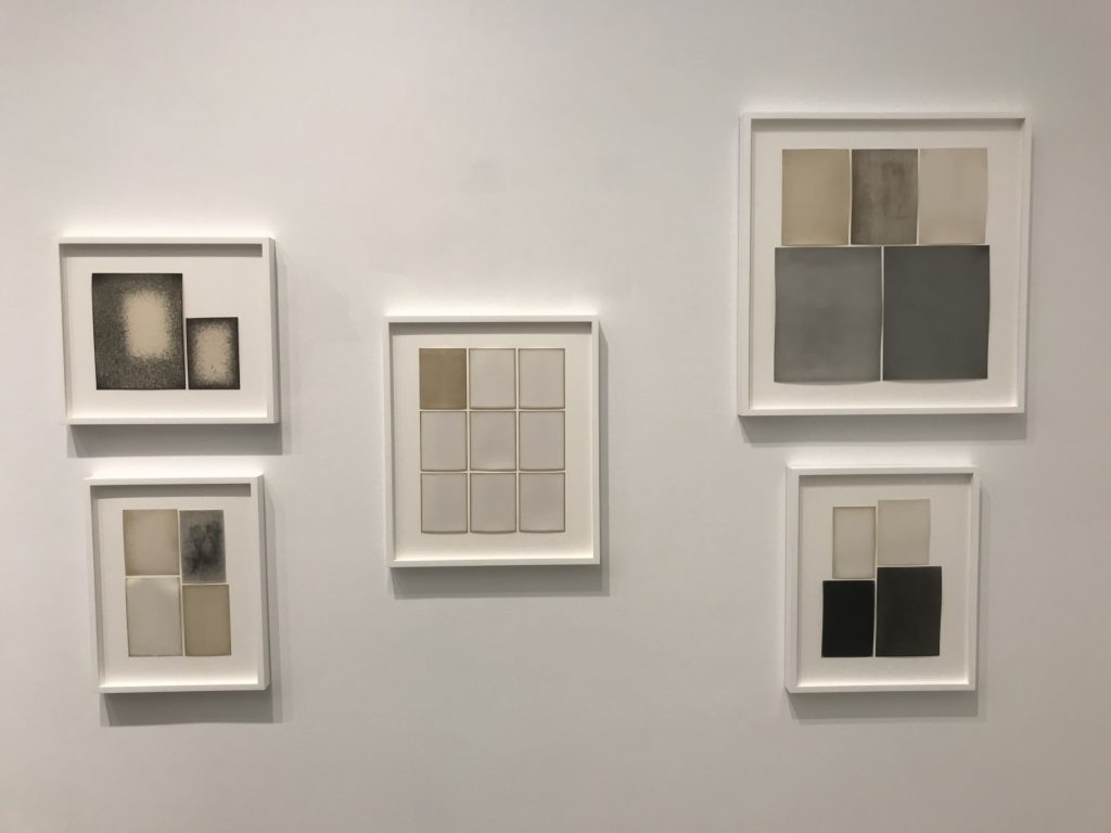
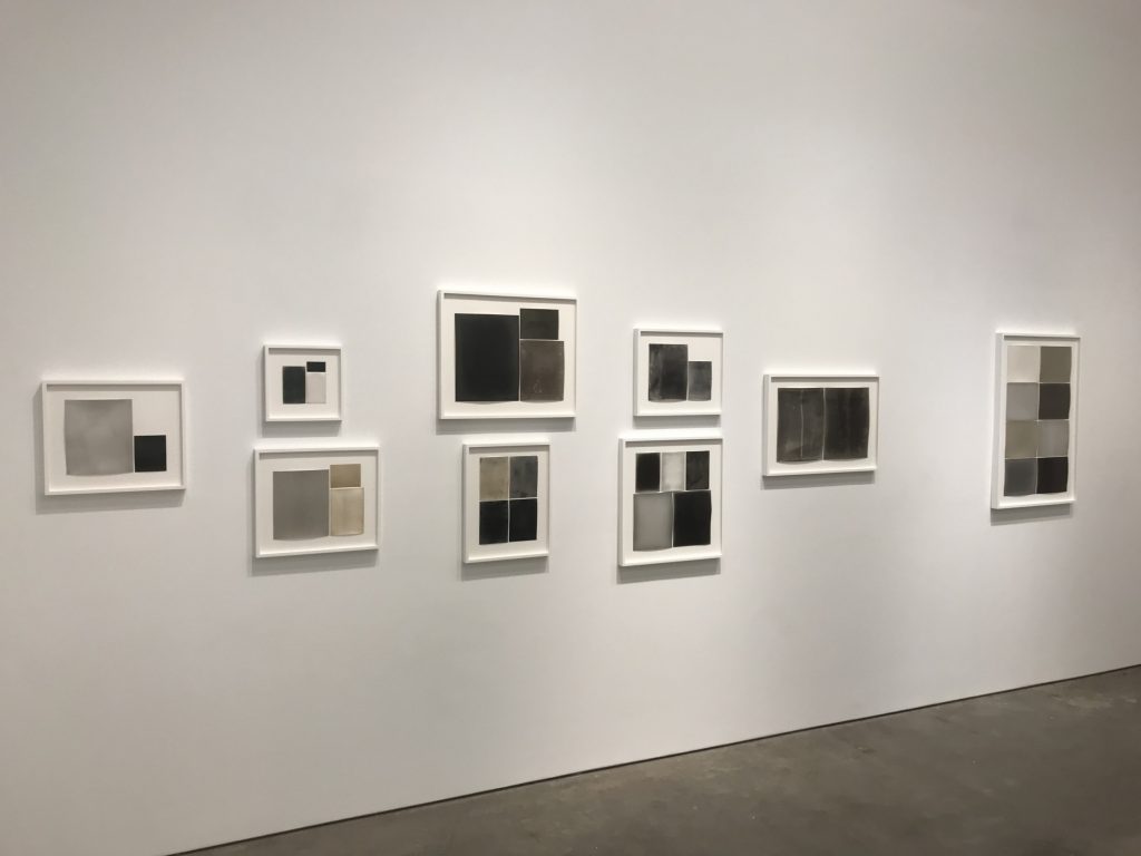
JTF (just the facts): A total of 46 black and white photographic works, framed in white and unmatted, and hung against white and grey walls in the East and West gallery spaces. All of the works consist of gelatin silver prints, in groups ranging from single prints to as many as 9 prints framed together, made in 2010, 2019, and 2020. The papers themselves date from 1918 to 1948. Physical sizes of the framed works range from roughly 13×9 to 71×54 inches (or the reverse), and all of the works are unique. (Installation shots below.)


Comments/Context: Unlike almost any other contemporary photographer working today, Alison Rossiter places photographic paper itself at the heart of her work. Imagine a painter whose paintings result from various examples of raw stretched canvas, or a poet whose poetry is rooted in the variations in blank sheets of paper – Rossiter is this kind of photographer, an artist whose journey is thoroughly enmeshed in the very materials from which the medium is made.
But unlike the raw materials of most other artistic mediums, light sensitive photographic paper has the potential to tell a surprisingly wide range of invisible stories, via the latent imagery inadvertently captured on the paper over the years since it was manufactured. There might have been light leaks into the box or envelope where the paper was stored; the chemicals might have degraded or decayed over time; mold or mildew might have gotten into the box and mixed with the surface of the paper; or individual sheets might have been spilled on, or touched by a previous photographer, leaving behind stains or fingerprints. While not exactly endless, there are enough possibilities for contamination that each sheet (especially sheets of decades or even centuries old and expired paper) carries its own potential residues and mysteries, with chance, time, and environment combining to generate unexpected outcomes.
With digital technologies (both for photographic image capture and printing) becoming overwhelmingly dominant, it is natural that older chemical-based processing techniques have lost ground, and in a strangely backward way, this has likely been positive for Rossiter, as more obsolete papers have come out from their hiding places. Rossiter sources her papers from all over, particularly from other photographers and by scouring Internet marketplaces like eBay, but with each passing year, the scarcity of these expired papers increases. Given this constraint, Rossiter has to be careful with each batch of antique paper, making the most of its unique characteristics.
With the benefit of hindsight, we can now see that Rossiter’s art resolves itself into two separate groups, essentially based on what she finds in her tests of the papers. If the papers are more recent, less scarce, and are found to be generally without unexpected eccentricities, Rossiter has used them for more interventionist works, where she selectively develops the papers to create her abstractions. Over the years, she has experimented with pours, dips, and other techniques, creating both hard edged geometries and more sinuous curves, which she has then built up into pairs, grids, and other arrangements. But if the papers are older, scarcer, and are found to have some quirks, she has been much more hands off, allowing the inherent qualities in the paper to come forth during development. And again, she has then arranged these ghosts and residues into larger, multi-part compositions that expand, explore, and celebrate their visual possibilities.
Encouraged to respond to the works of Anna Atkins for a group show at the New York Public Library in 2018 (reviewed here), Rossiter dug back into her horde of photographic papers to unearth the very earliest examples. This effort ultimately came together a series of 12 works (each consisting of between 4 and 7 individual prints), made from papers dating between 1898 and 1918. The works were acquired by the library, and will be published as a photobook entitled Compendium 1989-1918 by Radius Books (here) later this year. This gallery show picks up where that first project left off, exploring the block of time between 1918 and 1948. Dates matter to Rossiter, so her compositions are built from papers from the same year or the same few years, giving them each a particular historical resonance; in the back gallery, the works are arranged in chronological order around the walls, further highlighting the idea of a time line progression.
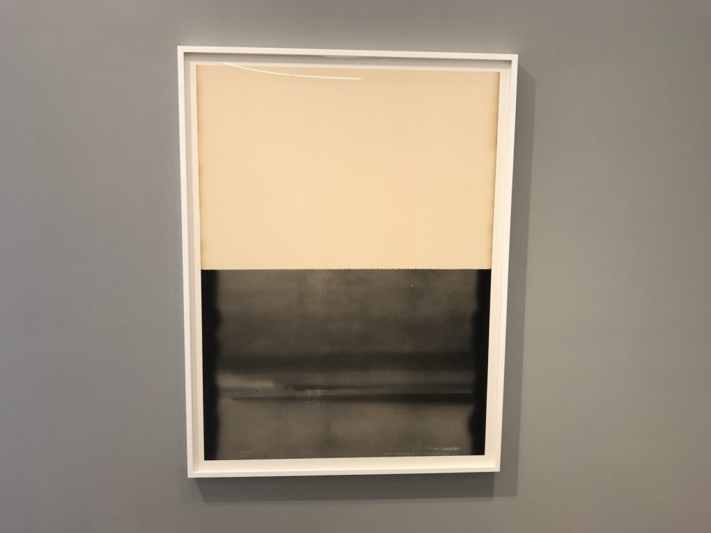
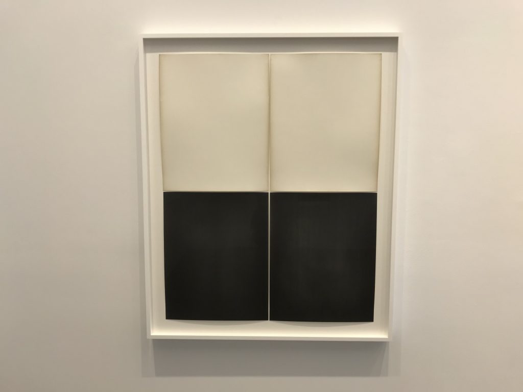
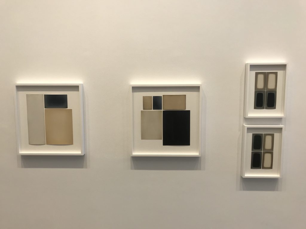
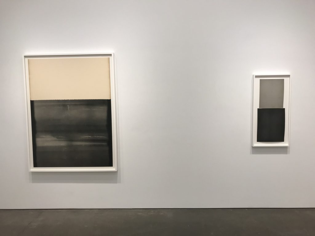
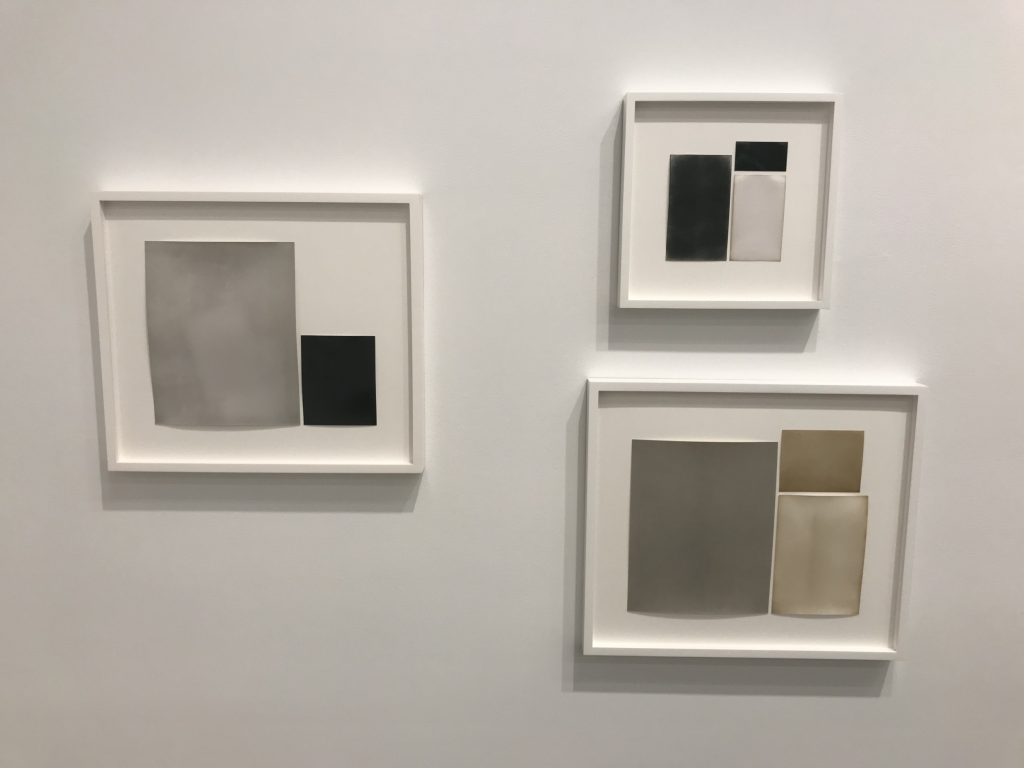
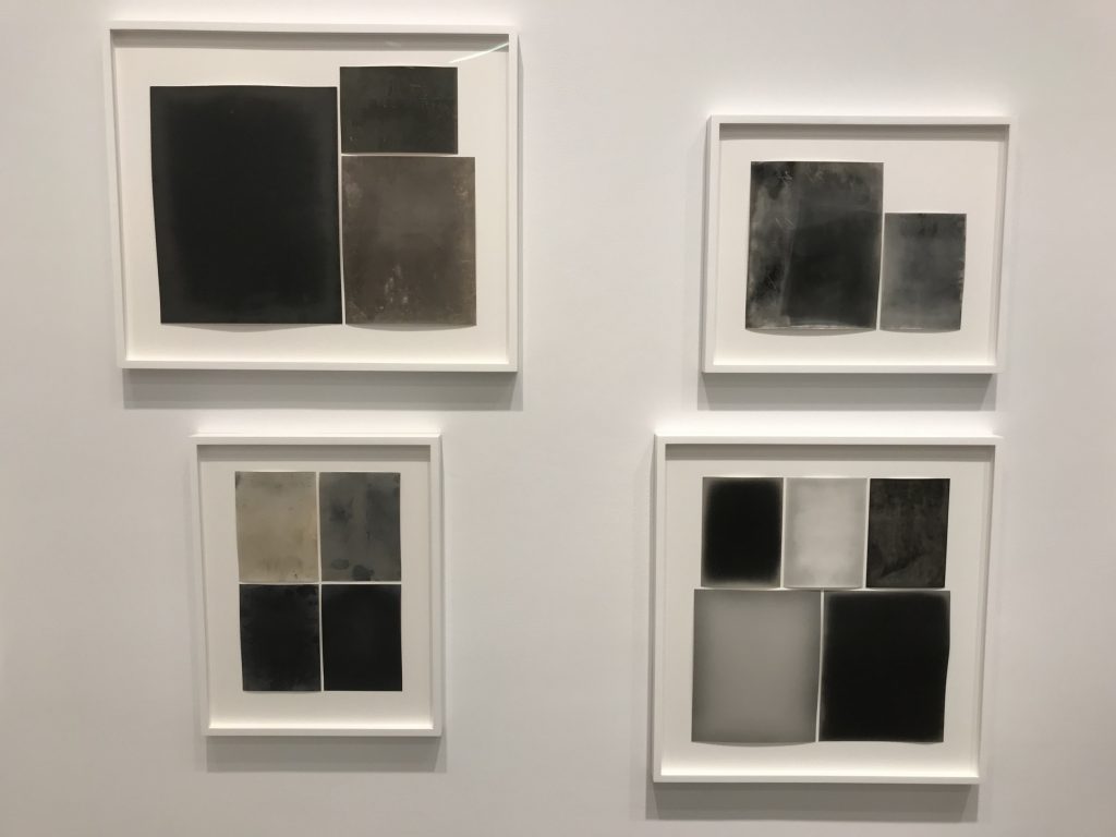
Most of Rossiter’s compositions here are primarily and fundamentally geometric. The individual component sheets range in color from white to black, with intermediate steps at various shades of grey, as well as cream, light yellow, muted gold, and light tan. The developed sheets (of different sizes, some of them test strips or smaller rectangles) are then gathered into groups and arranged into clusters of color blocks. In most of these works, there is little or no latent imagery that catches our eyes – there may be some edge darkening or ghosting, or some subtle color variation across the sheet to some extent, but in general, the color of the blocks is relatively flat. Rossiter then uses these sheets as the raw material for compositional exercises, particularly testing the visual weight and balance of different potential combinations.
Rossiter is meticulous in working through the possible permutations. With two sheets, the blocks can be the same size or unbalanced, side by side or atop one another, both the same color or opposing colors. With three sheets, the color arrangements can now include three colors, and the scale choices of the clusters can include three different sizes. With four sheets, grids make an entry (both equal and unbalanced), and now four colors and four sizes can wander or repeat. And this iterative experimentation continues all the way up to as many as nine prints, where a 3×3 grid of sheets can be all white, variations of white and cream, and interrupted by a single golden block. In general, the compositions feel carefully built, the proportions and colors of the blocks (a big black sheet balanced by smaller ones of lighter colors, or a checkerboard pattern, or a tall thin central strip flanked by paired stacks) methodically arranged to create alternate forms of abstract push and pull.
But it’s when Rossiter discovers papers that have latent imagery that the compositions move from strict studies of color and form into something far more poetic. Ghostly rectangles (from test sheets) float atop mottled and spackled backdrops. Faint vertical lines (made from the misaligned openings of envelopes) zip through the darkness. Soft crackles blossom along the edges of sheets like ice crystals or Queen Anne’s lace. Moldy clouds are interrupted by pinprick points of lights like stars. Chemical stains and drips turn yellow into watery brown and grey into pewter blue. And any number of billowy auras, cracks, flares, tunnels, frostings, spores, glows, and mysterious hovering rectangles coalesce from nothingness, their subtle associations and almost narratives reaching back into the misty past.
The show also includes three extra large pieces, made from an oversized roll of Gevaert Gevaluxe Velours paper from the 1930s that Rossiter acquired from the Belgian artist/photographer Pierre Cordier. Rossiter tried three different approaches with these cut sheets: developing half the paper (thereby creating a bisected composition of dark/light), developing two thirds of the paper, and developing the entire paper (all dark). From the ripples and folds in the residue, it appears the paper may have been stored as a crumpled roll for quite some time, and the sheer scale of the paper changes the viewing dynamic from close in, intimate viewing to a more muscular wall-filling presence.
This is the kind of show that stubbornly resists digital viewing, however excellent the online reproductions and installation shots may be – the works require close inspection to catch all their nuances, and their physicality (and the history that it represents) is an integral part of the experience. It is a body of work that quietly simmers with sophistication, and rewards those willing to give it a deliberate and measured look.
Collector’s POV: The works in this show generally range from $11000 to $22000 each, with the very largest prints priced at $65000 each. Rossiter’s work has little secondary market history at this point, so gallery retail remains the best option for those collectors interested in following up.


I was mixed on this show – in one hand Alison shows an incredible commitment to her medium and a wide range of ideas. But, the sheer quantity of images shown and the diversity of ideas made the show feel scattered and unfocused in what it wanted us to do.
Light sensitive paper and photograms etc require a delicate balance – you want the viewer to focus on the materiality of the photographic paper. But these photos are grouped together with other works, placed in an offwhite frame, and aren’t fully matted down (most of the images were peeling at the sides).
It’s a great exploration into color and thought process but I think the exhibit would have been clearer in its thought if 70% of the work was removed so that the walls only showed the strong work. Just my personal preference but appreciated the work and think the ideas here are incredibly strong.