JTF (just the facts): Self-published in 2020 (artist’s site here, no book link available). A series of 12 pieces sent by the postal service. Includes three inserts with texts by the artist and Mae Stone. (Cover and spread shots below.)
Comments/Context: Barry Stone lives and works in Austin, Texas, where he also teaches at the School of Art and Design at Texas State University. A few years ago, he published In A Nimble Sea (reviewed here), where he used digital glitching, raw code symbols, and layering to construct his visual narrative. Stone’s newest project intermingles family, landscape, and chance, and also explores the physicality of printed matter and its connection to crafting a story.
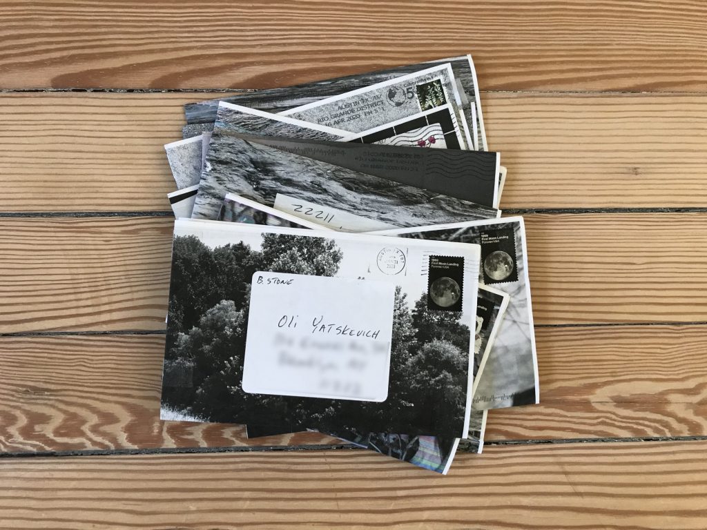
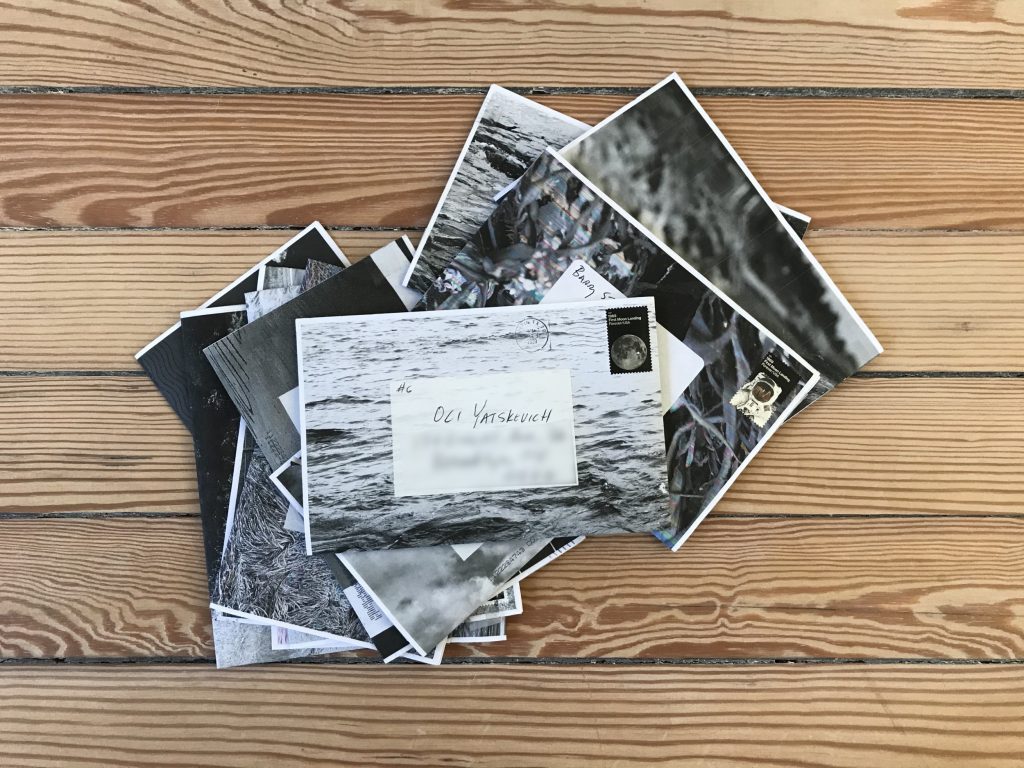
For this series, Stone felt it was essential that his images traveled and got physically marked by their passage. And so he started mailing the images to a group of people, and the pieces gathered scratches, wrinkles, and other imperfections as they worked their way through the postal system. Mail art, as a distinct art expression, has its roots in the early 1960s, and in the United States is often associated with Ray Johnson; in contemporary photography, some of the most well known examples of late include Moyra Davey’s ongoing “mailer” projects (several were included in her 2014 gallery show, reviewed here). Stone’s series is an excellent illustration of a thoughtful mail art project, and what’s different than most is that its final form is envisioned as a photobook.
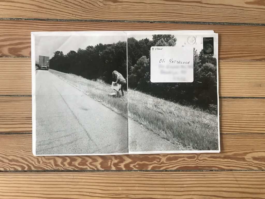
The series consists of 12 weekly mailings. Each piece is elegant and thoughtful: a two-folded paper with full bleed photographs, with a removable sticker with an address, and a stamp (there are no envelopes or other packaging). One of the first pieces also contained an insert note, informing us that “after the images have been delivered, they will form a cohesive book.” There are discrete page numbers but Stone also notes that one doesn’t have to follow any order in puzzling together the visual narrative.
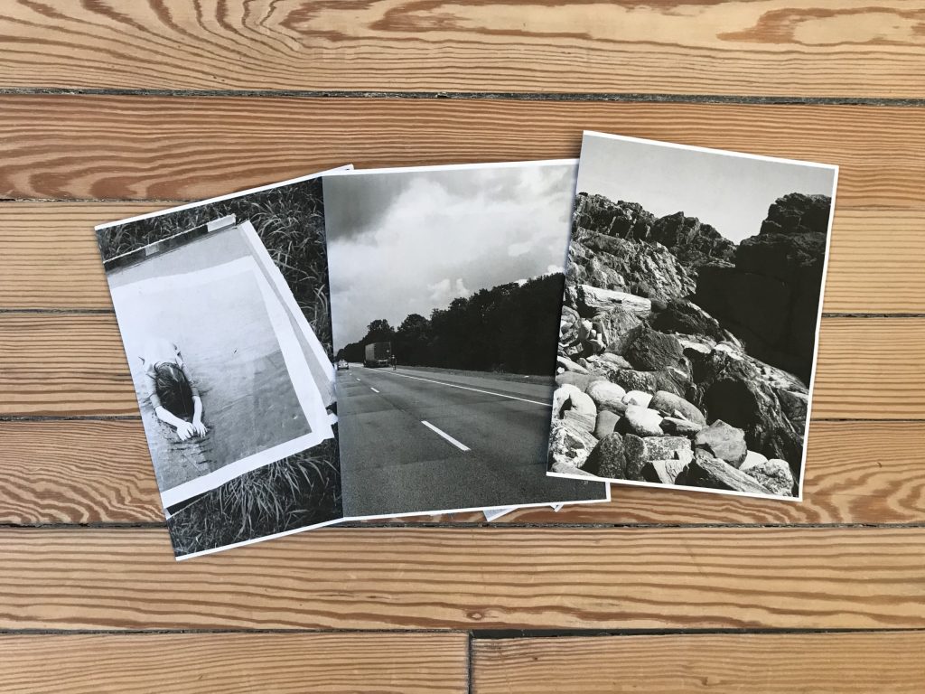
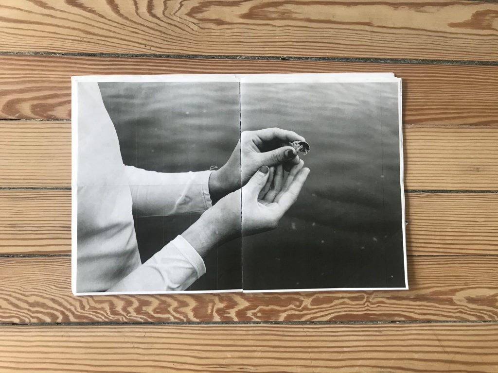
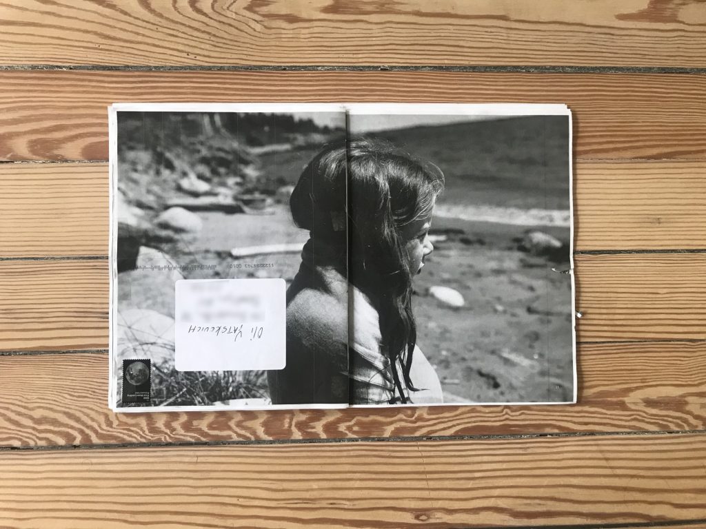
As the mailings arrived over a couple of weeks, I spent time with each piece, slowly trying to piece the larger story together. The front of the first mailer looks like trippy digitally distorted seaweed or leaves. It unfolds to a photograph showing cradled hands, with two fingers hold a tiny crab against the background of calm water. It then opens to a spread with two more vertical images: a truck parked on a side of a highway and a woman picking up some loose papers in the grass, and a boy on a beach as he bends over with his hands in water. With just these first images, it was hard to figure out the connections.
But as the mailings kept coming, one by one, they started to slowly unfold into a coherent set of connected moments. The first few pieces revealed the themes of the project: children and family, a beach/seaside vacation, and various road trips and tire skids, setting a mood of creeping unease. The process of putting these fragments together and waiting for next mailing was exciting and rewarding. About halfway through the project, the mailing included a text by Mae Stone, artist’s daughter, providing the main key to the backstory. Her emotional writing starts with “the first thing you should know is that we lived,” and she goes on to describe the car accident she got into with her mother and younger sister – “the most traumatic moment in our family’s history.” We learn that Stone joined his family right after the accident, and instead of returning home, they rented a car and continued their trip to Maine. “Things may happen, bad things that you can’t predict. They change you but they don’t stop you.”
As the series accumulates, it becomes clear why the physical markings of posting were important: they echo the family’s physical travel, relate to the car accident, and reflect their damaged emotional state. The pieces I received traveled from Texas to New York and were marked by postal stamps, clear tape, and had some minor tears, but otherwise arrived in a good physical condition – they had just enough scuffing to smartly connect to the imagery inside.
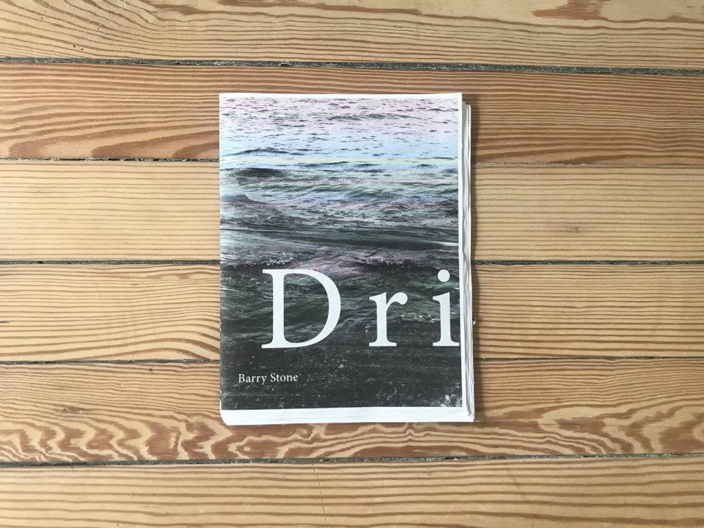
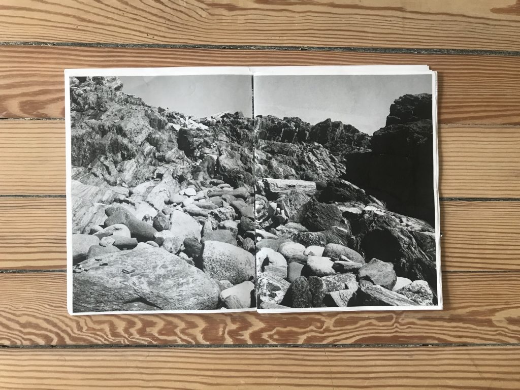
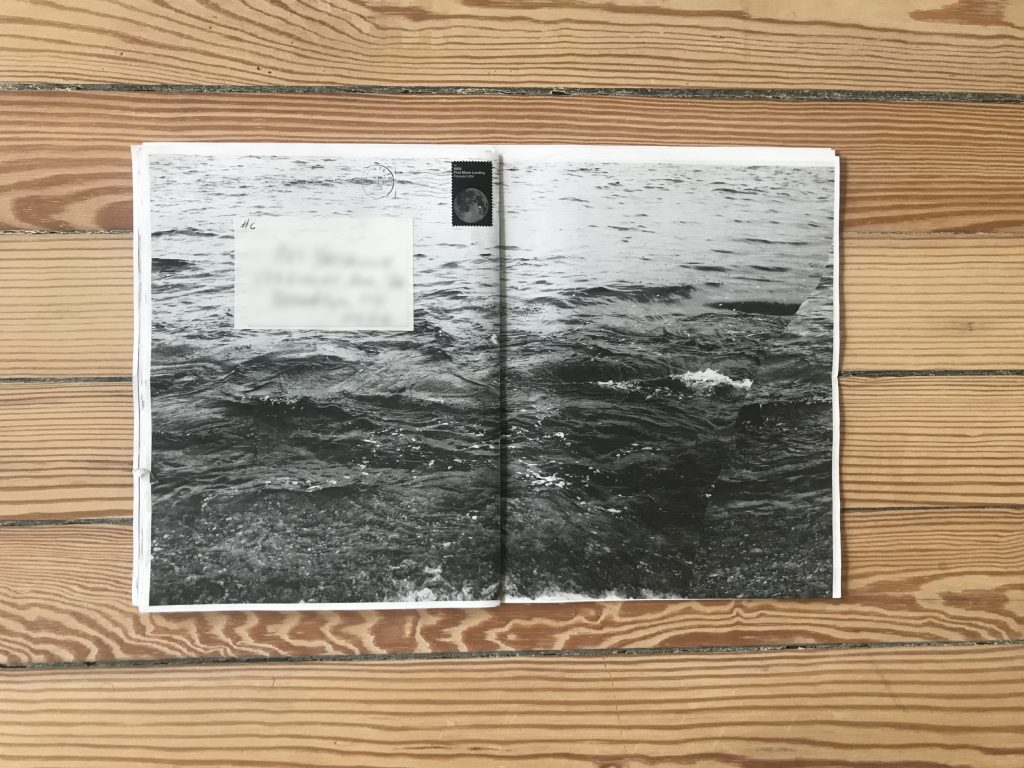
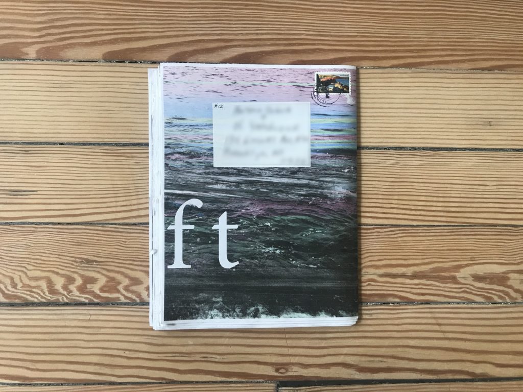
The last mailing was the cover, revealing the name of the project. It is titled Drift and the title is placed at the bottom of an image depicting water, starting on the front and continuing on the back. The stamp on this final piece celebrates the 200th anniversary of Maine statehood; it features a painting by Edward Hopper, depicting a picturesque rocky coastline. The colors of a stamp resonate with the colors of the photograph; it is also symbolic as Stone’s family spends their vacations in Maine every year. We also learn, from the final insert, that the photographs were taken in Maine and Alabama where the crash happened.
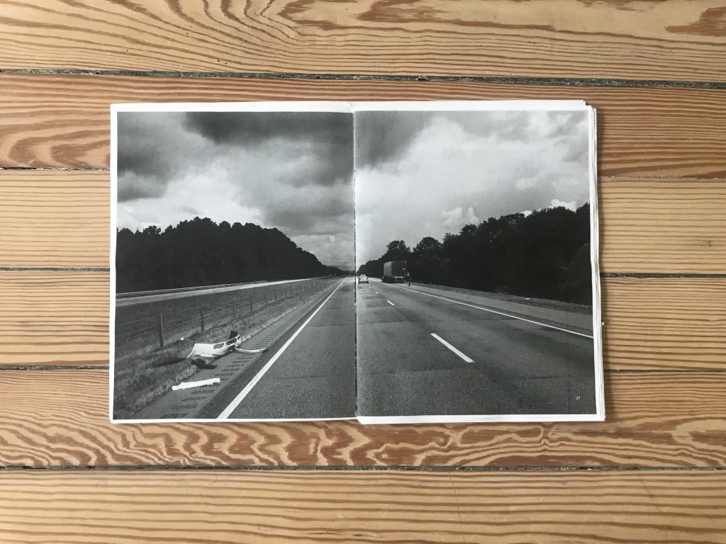
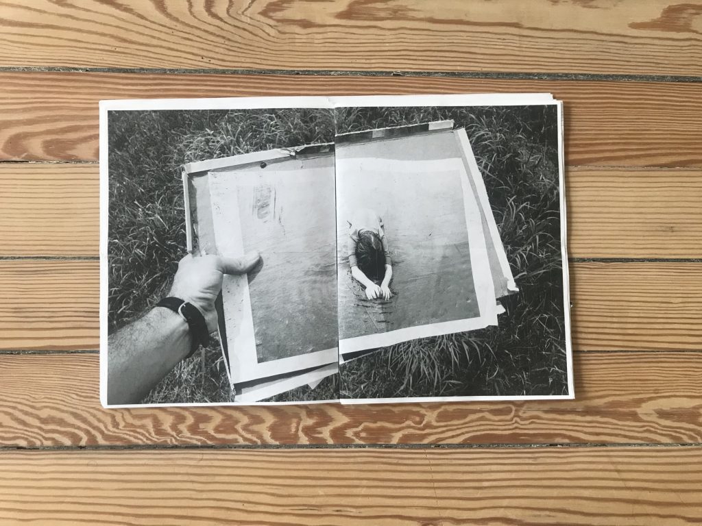
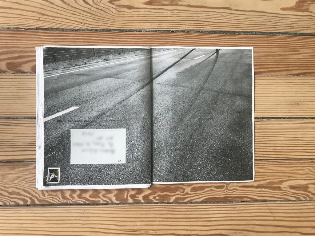
When assembled, the pages form a cohesive photobook, and it is very moving to look at the project again, now in its entirety. My version of Drift opens with a full spread showing highway asphalt with marks from burnt tires, indicating both a road trip and possibly something happening while on the road. Some of the photographs are altered by manipulating the underlying code, adding various distortions and shifts in the texture and colors. A full spread photo captures two girls floating in the water close to each other (highlighting the family connection), and there are other shots of rocky coastline and calm beach landscapes that help set the scene. A full spread shows a highway and a smashed bumper on the edge of the road; in another shot a woman collects papers that flew out of the car. A number of images capture prints with tire marks, stains, and tears; in one, a man’s hand holds a print of a girl in water. These are the papers that flew out of the car, and they carry physical marks of the car accident, the images and papers become nested like dolls. Seen together, Drift is a way to reflect and process the trauma related to the accident, and to bring back together pieces that have been broken apart.
Stone’s project brings to mind Lucy Helton’s book Transmission (reviewed here), envisioned as an environmental warning message from the future, in that it also deliberately reaches beyond the traditional photobook form to match the overall message. The physicality of that project was emphasized by printing photographs using old fax machines and placing them inside a cardboard tube. Drift is a similarly brilliant example of thinking creatively about what a photobook can be, considering both the form and the content, and ultimately using the post office to creating a distinct, thoughtful, and intimately tailored experience.
Collector’s POV: Barry Stone is represented by Klaus von Nichtssagend Gallery in New York (here). His work has not yet found its way to the secondary markets, so gallery retail remains the best option for those collectors interested in following up.


